Orion Federal Credit Union saw an opportunity to benefit Memphis and the communities it served when it chose to move its headquarters to the former downtown factory of an iconic bread company. The imposing 1921 building had been vacant for several years, and Orion hoped to anchor a historic Memphis neighborhood while spurring commercial and residential growth.
Memphis’ LRK spearheaded the architecture and interior design. It chose to keep the original shape and bones of the 63,000 sq.ft. space but added a third story with 7100 sq.ft. of office space and a large rooftop patio.
Working with the original “bones” meant utilizing existing concrete floors and walls, open ceilings and ductwork. And with large industrial windows on all four sides, great natural light was already a given. So, there was an opportunity for some creativity with the lighting design, with a chance to focus more on aesthetics than functionality in some spaces.
Conceptually, the lighting design team at LRK played with the company’s name, invoking the concept of Orion’s Belt and shooting stars to introduce lighting with a space theme. They therefore tried to keep the lighting low; everything is dark unless necessary.
Concrete walls and floors form a central “track” around the office areas and workstations. These hallways are illuminated with A-Light’s Accoled ACL3. But instead of centering the linear luminaire over the pathway, the fixture is suspended adjacent to the concrete wall.
The focus is on lighting the walls. ACL3’s patented HE Tech™ lens provides direct distribution to illuminate the wall and artwork, and the ambient light is sufficient to provide safe passage along concrete pathway.
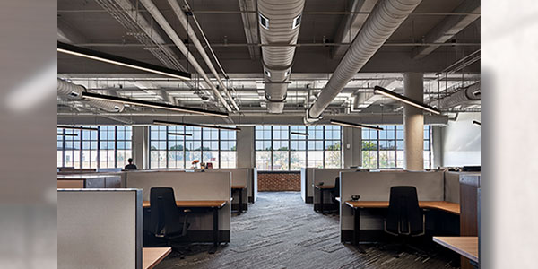
Designers took a unique approach to the open office areas as well. The workstations are somewhat standard, with desks and privacy panels laid out parallel and perpendicular to exterior walls. Ductwork above is also linear. So, the team created a dynamic space by laying the striped carpet on the diagonal and the ACL3 luminaires over the workstations are suspended in a similar fashion.
The result is linear lighting that is anything but traditional. The 12’ lengths of each ACL3 are suspended so that they illuminate two workstations. Design-wise, they create a lot of movement as they break up the ductwork above.
Sizing was a factor in selecting A-Light products for the project.
For more information, please visit: www.acuitybrands.com
The opportunity to work with the ACL3 in 12’ lengths was cited as a huge advantage for the design team, which wanted big segments of light. Most manufacturers don’t offer lengths beyond 8′.
Lighting designers also appreciated that A-Light could offer complementary fixtures in other spaces in the building. As an example, the kitchen/break room has a drop ceiling, so a pendant fixture was not appropriate. Instead, they chose the Accoled ACL5, a recessed luminaire that maintains the linear design aesthetic while offering illumination that is consistent with the ACL3 installations elsewhere.
Feedback from the project has been overwhelmingly positive. By taking an imaginative approach to lighting design, LRK has created a striking “celestial” work environment for the Orion team, and is lighting the way for future growth and development in the downtown Memphis core.


